The Opening Act of A Hyper-Personalized User Experience
As consumers, we used to seek out products and experiences. Today, we have grown accustomed to products and personalized experiences being delivered to us (e.g., UberEats, Amazon, Groupon, etc.).
Here’s some food for thought:
Why should our professional lives be any different?
Today, a great user experience means providing employees with the technology, processes and personalized insights necessary to drive engagement and improve productivity. With this fact in mind, we are excited to announce that Avature 9.1 is here! We are rolling out some of our most visually compelling UI enhancements yet, and all are focused on providing employees with a dynamic (and rewarding) user experience – one designed to allow users to work smarter, not harder.
Given the immediate impact of these UI enhancements on the visual experience of the user (including style, character and access information), today we will review what visual changes you can expect to find in Avature 9.1. But remember – this is just the beginning. With our ambitious roadmap in hand, the best is yet to come for Avature users. As always, we will be releasing new functionalities and enhancements every two weeks that will only continue to improve our industry-leading user experience.
Let’s dive in.
Customizable Home Dashboard
A dashboard is only as effective as the information that it communicates.
While many solutions in the market provide easy access to the data, functions, controls and visualizations that organizations need, they often fail to differentiate between user groups and each user’s specific requirements.
At Avature, a core tenet of our platform has long been meeting the needs of our users. With our first release of Avature 9.1, we are taking this principle to the next level with Avature Home.

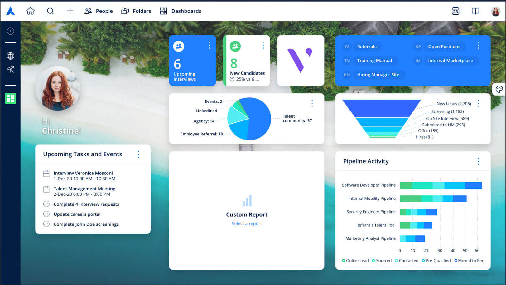
Designed with the specific goal of creating a tailored user experience where information thrives, Avature Home acts as the go-to place for users to find their most important assets, both when they first log into Avature, and throughout the workday. Recognizing that your users (i.e., recruiters, sourcers and admins) all manage a diverse range of responsibilities and priorities, we have designed Avature Home to bring clarity and focus to the items that matter most to each user.
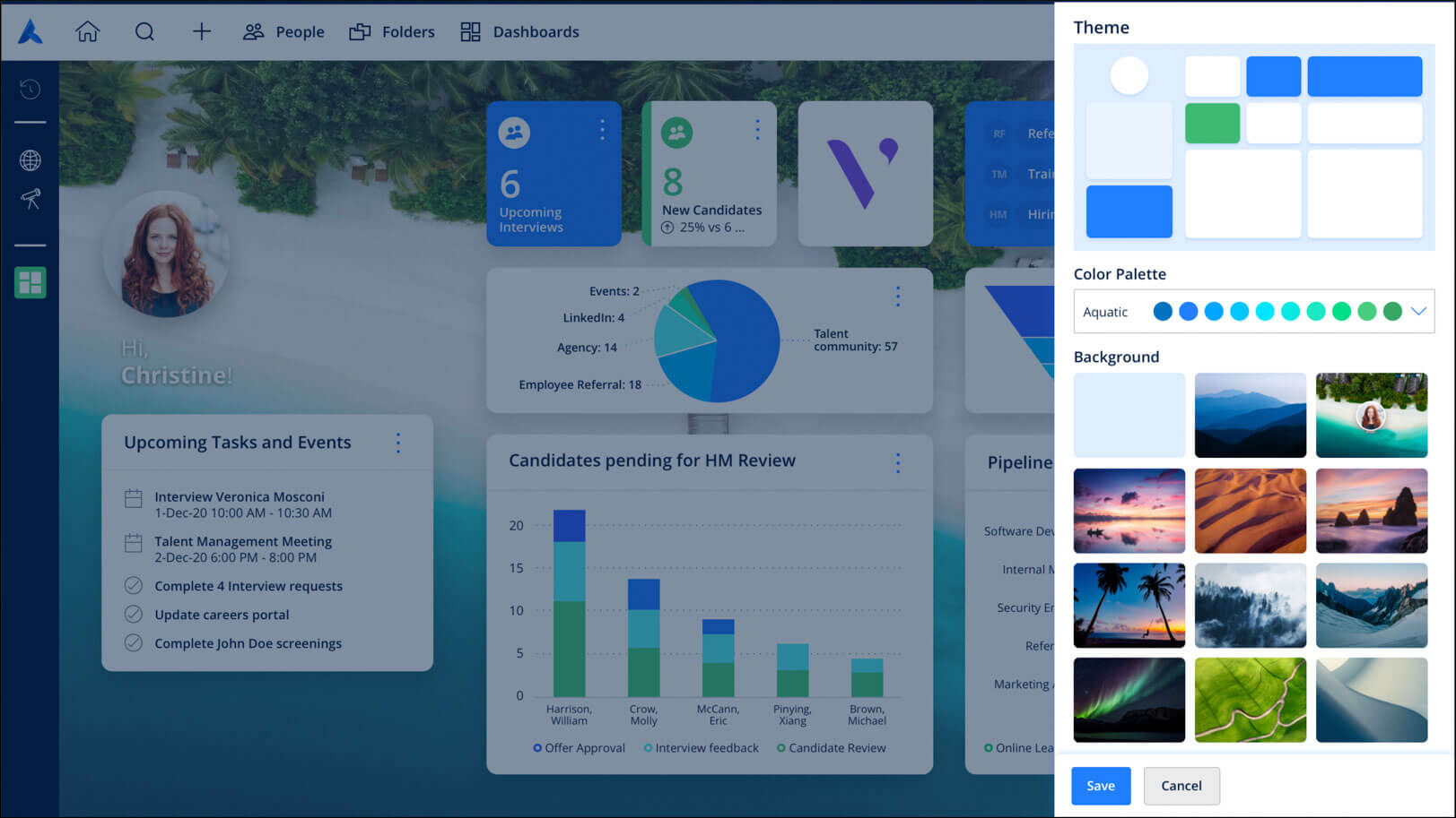
With Avature 9.1, not only are organizations empowered to design different versions of Avature Home for different users, but users can now decide what content they want to see and how they want to see it. Thanks to an intuitive and simple creation workflow, users can select and combine a number of unique components to construct their ideal Home experience. These components include their calendar, lists, favorite links, custom reports, color palette and background image, the ability to easily visualize pending tasks and much more!

Improved Navigation Top Bar
At Avature, we have long understood that a poorly designed navigation experience can steepen an application’s learning curve and result in a frustrated user. It is for this reason that we have consistently strived to provide our users with an efficiently designed navigation experience that allows them to flow smoothly through the platform.
Since work first began on Avature 9.1, our goal was to take our best-in-class navigation and make it even better.
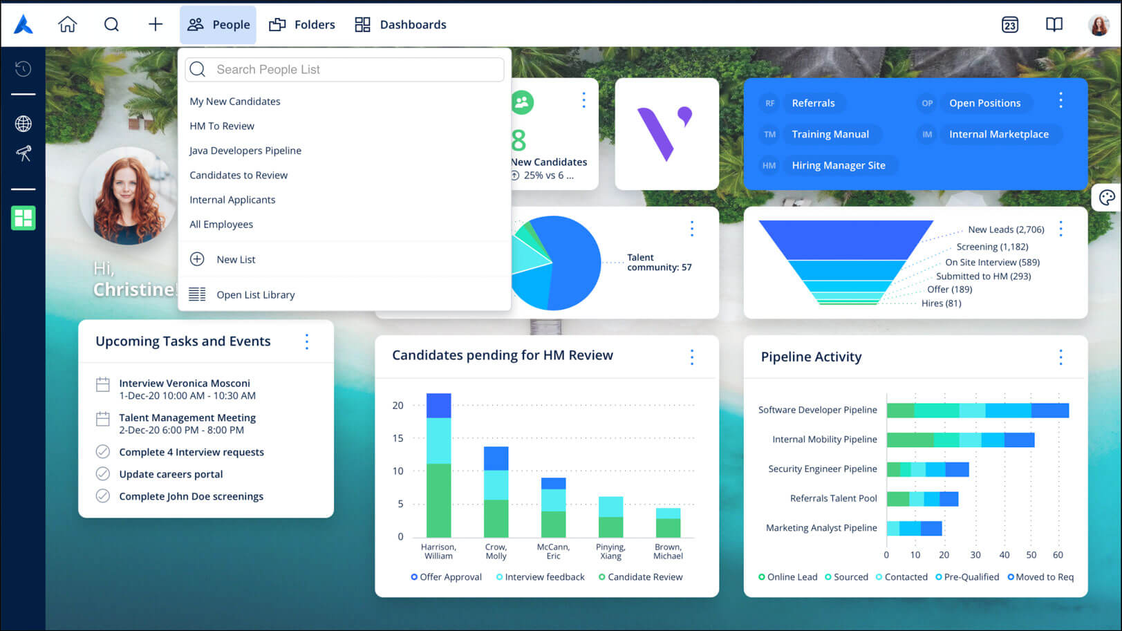
With Avature 9.1’s new navigation bar, users can now effortlessly find their most critical resources while enjoying an even more cohesive navigation experience. Designed with users in mind, our brand new navigation bar features the main tools used to navigate the platform (such as quick search and user lists). Users can also easily create and manage records, access their calendar and adjust their users settings.
The result? An intuitive, seamless and rewarding navigation experience built for supercharged productivity.

New Login Experience
Login is a powerful tool that sets the stage for any SaaS user experience. When it comes to logging in to Avature, we have always strived to provide our non-single-sign-on users with an intuitive experience that reduces friction and allows login to lead the way, replicating the seamless experience of those who use SSO.
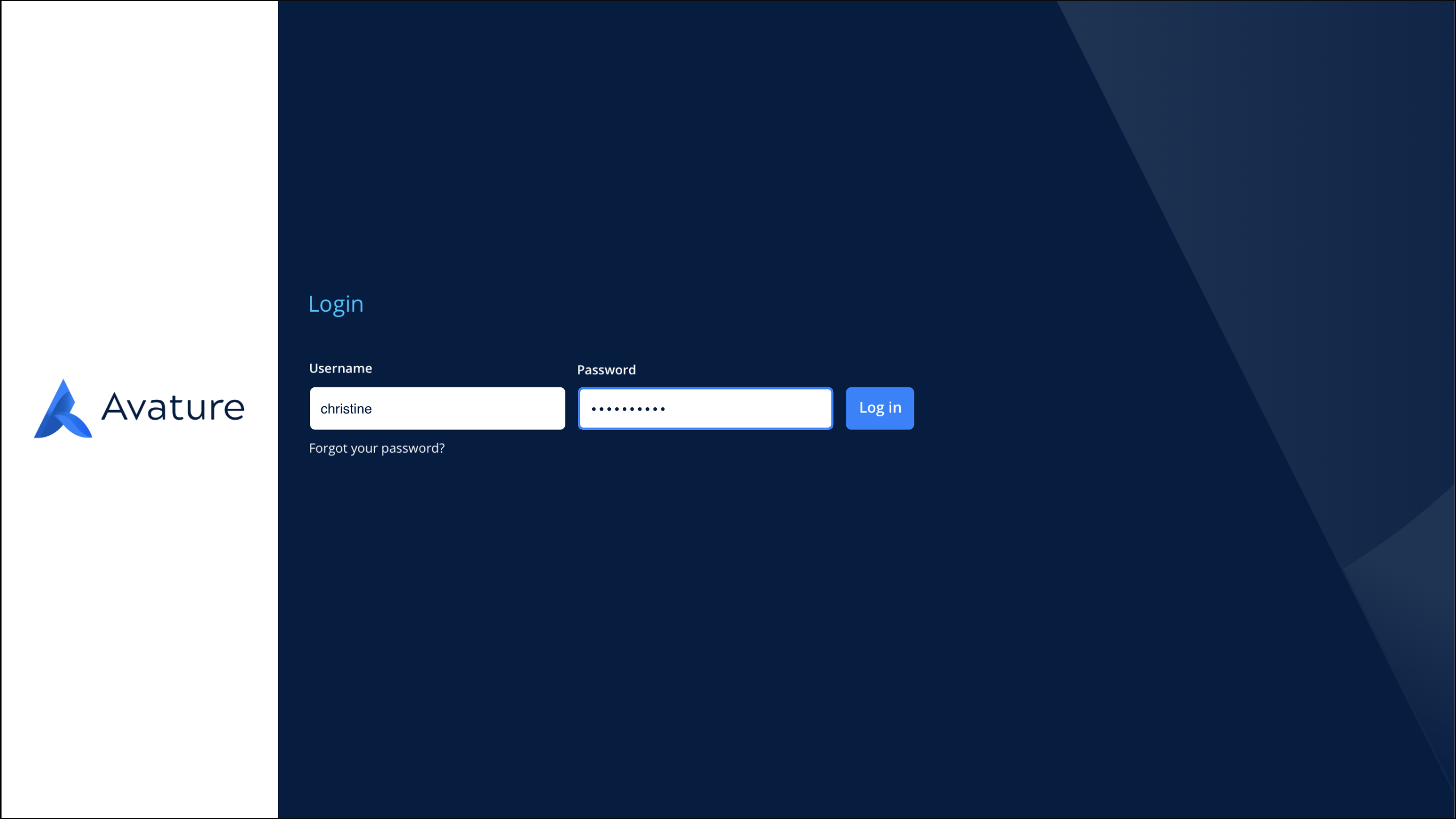
With this fact in mind, Avature 9.1 now comes with a revamped login page that greets users with a new style and branding that matches the rest of the user interface. This design offers users a cleaner and more attractive experience from the very beginning, while new eye-catching animations provide users with a smoother transition to their main dashboard.

Interested in Learning More?
At Avature, the needs of our customers have always played a crucial role in shaping the evolution of our platform. Avature 9.1 is no different. With its ability to provide users with a tailored experience that drives both adoption and productivity, Avature 9.1 was built to meet the needs of the modern enterprise.
For more information on the capabilities discussed above and how to enable them, please contact your Avature representative. Don’t forget to be on the lookout for support opportunities in the form of video news (including detailed descriptions of the new functionality) and live training demos.
And remember, we will be adding new features every two weeks!


